Morphing Glass Buttons
One glass button that blooms into three, a zoom control fused into a single pill, and the new glass button styles — the Liquid Glass toolkit, one dish at a time.
- Serves
- iOS 26+ · iPhone and iPad
- Prep time
- 25 minutes
- Kitchen-tested
- Compiled with Xcode 26.6 · iOS 26.5 simulator · Oct 26, 2026
- Difficulty
- ★★☆
GlassEffectContainer(spacing:).glassEffect(.regular.interactive(), in:)Glass.tint(_:).glassEffectID(_:in:)with@Namespace.glassEffectUnion(id:namespace:).buttonStyle(.glass)and.glassProminent
The most striking thing about Liquid Glass isn’t the blur. It’s that glass behaves like a liquid: tap the button in Maps or Camera and new controls don’t fade in, they bead off the original button and slide into place, and when you dismiss them they flow back in. SwiftUI in iOS 26 gives you exactly that behaviour, and it takes three things: glass on each control, a container that lets the shapes see each other, and an identity for each shape so SwiftUI knows which one becomes which.
This recipe builds a floating action button over a photo that blooms into three actions, a Maps-style zoom control, and a save bar using the stock glass button styles.
Method
1. Name the actions
Each morphing shape needs a stable identity. An enum is the natural fit. One Swift 6.2 detail matters here: glassEffectID requires its identifier to be Sendable as well as Hashable. New Xcode 26 projects isolate code to the main actor by default, which can make a plain enum’s conformances main-actor isolated, so mark the enum nonisolated to keep it usable as a glass ID anywhere.
1
2
3
4
5
6
7
8
9
10
11
12
13
nonisolated enum KitchenAction: String, CaseIterable, Identifiable {
    case timer, note, photo

    var id: Self { self }
    var title: String { rawValue.capitalized }
    var systemImage: String {
        switch self {
        case .timer: "timer"
        case .note: "note.text"
        case .photo: "camera"
        }
    }
}
2. Build the cluster
Every button gets .glassEffect with .interactive(), which makes the glass respond to touch: it flexes and brightens under your finger. The toggle is tinted orange so it reads as the primary control. Wrapping them all in a GlassEffectContainer is what lets the shapes interact, and .glassEffectID ties each one to an identity in a shared namespace. When isExpanded changes inside withAnimation, SwiftUI morphs the glass: new buttons emerge from the toggle’s shape, and collapse back into it.
1
2
3
4
5
6
7
8
9
10
11
12
13
14
15
16
17
18
19
20
21
22
23
24
25
26
27
28
29
30
31
32
33
34
35
36
37
38
39
40
41
42
43
44
45
struct GlassActionCluster: View {
    @State private var isExpanded = false
    @Namespace private var glass

    var body: some View {
        GlassEffectContainer(spacing: 12) {
            VStack(spacing: 16) {
                if isExpanded {
                    ForEach(KitchenAction.allCases) { action in
                        Button {
                            perform(action)
                        } label: {
                            Label(action.title, systemImage: action.systemImage)
                                .labelStyle(.iconOnly)
                                .font(.title2)
                                .frame(width: 56, height: 56)
                        }
                        .buttonStyle(.plain)
                        .glassEffect(.regular.interactive(), in: .circle)
                        .glassEffectID(action, in: glass)
                    }
                }

                Button {
                    withAnimation(.bouncy) { isExpanded.toggle() }
                } label: {
                    Image(systemName: isExpanded ? "xmark" : "plus")
                        .font(.title2.weight(.semibold))
                        .foregroundStyle(.white)
                        .frame(width: 64, height: 64)
                        .contentTransition(.symbolEffect(.replace))
                }
                .buttonStyle(.plain)
                .glassEffect(.regular.tint(.orange).interactive(), in: .circle)
                .glassEffectID("toggle", in: glass)
                .accessibilityLabel(isExpanded ? "Close actions" : "More actions")
            }
        }
    }

    private func perform(_ action: KitchenAction) {
        // Start the timer, open the note editor, show the camera…
        withAnimation(.bouncy) { isExpanded = false }
    }
}
The container’s spacing controls when shapes start to blend: the higher the value, the sooner two shapes reach for each other as they approach. Here it’s smaller than the stack’s 16-point gap, so at rest the buttons sit apart as separate drops, and only merge while they’re moving through each other.
3. Fuse two controls into one pill
Sometimes you want the opposite: separate buttons that render as one piece of glass, like the zoom control in Maps. .glassEffectUnion does this. Every glass effect with the same union ID, shape and variant is combined into a single shape.
1
2
3
4
5
6
7
8
9
10
11
12
13
14
15
16
17
18
19
20
21
22
23
24
25
26
27
struct ZoomPill: View {
    @Binding var zoom: Double
    @Namespace private var glass

    var body: some View {
        GlassEffectContainer {
            VStack(spacing: 0) {
                Button("Zoom In", systemImage: "plus") {
                    zoom = min(zoom + 0.25, 3)
                }
                .frame(width: 48, height: 48)
                .glassEffect(.regular.interactive())
                .glassEffectUnion(id: "zoom", namespace: glass)

                Button("Zoom Out", systemImage: "minus") {
                    zoom = max(zoom - 0.25, 1)
                }
                .frame(width: 48, height: 48)
                .glassEffect(.regular.interactive())
                .glassEffectUnion(id: "zoom", namespace: glass)
            }
            .labelStyle(.iconOnly)
            .font(.title3)
            .buttonStyle(.plain)
        }
    }
}
4. Use the stock styles for ordinary buttons
Not every button needs hand-built glass. For standard actions, iOS 26 adds two button styles: .glass for secondary actions and .glassProminent for the primary one, which fills the glass with the tint colour.
1
2
3
4
5
6
7
8
9
10
11
12
13
struct SaveBar: View {
    var body: some View {
        HStack(spacing: 12) {
            Button("Discard") { }
                .buttonStyle(.glass)

            Button("Save Recipe") { }
                .buttonStyle(.glassProminent)
                .tint(.orange)
        }
        .controlSize(.large)
    }
}
5. Plate it over a photo
Glass needs something behind it to bend. Put the photo in the background so it can bleed under the safe areas without affecting the layout, and float the three pieces in the corners with overlays.
1
2
3
4
5
6
7
8
9
10
11
12
13
14
15
16
17
18
19
20
21
22
23
24
25
26
27
struct GlassKitchenScreen: View {
    @State private var zoom = 1.0

    var body: some View {
        Color.clear
            .background {
                Image("hero-pancakes")
                    .resizable()
                    .aspectRatio(contentMode: .fill)
                    .scaleEffect(zoom)
                    .animation(.smooth, value: zoom)
                    .ignoresSafeArea()
            }
            .overlay(alignment: .topTrailing) {
                ZoomPill(zoom: $zoom)
                    .padding()
            }
            .overlay(alignment: .bottomTrailing) {
                GlassActionCluster()
                    .padding()
            }
            .overlay(alignment: .bottomLeading) {
                SaveBar()
                    .padding()
            }
    }
}
Using .background for the photo, rather than putting it in a stack, matters for the same reason as in the hero header recipe: a fill-mode image reports its natural size, and in a stack that would push the overlays off screen. A background is drawn behind the view without changing its size.
Plating
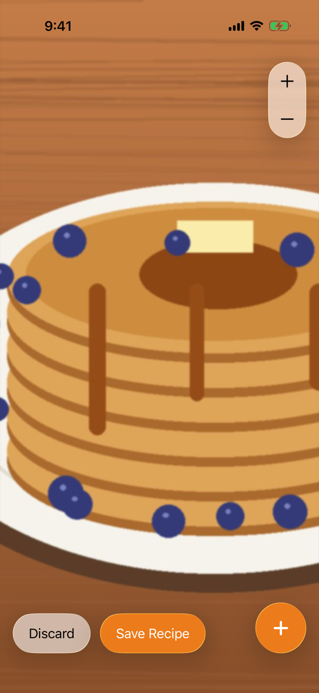
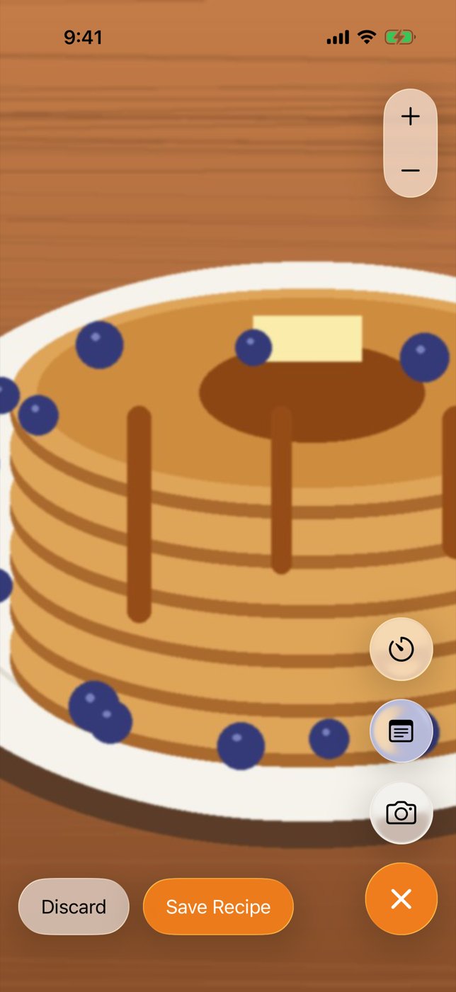
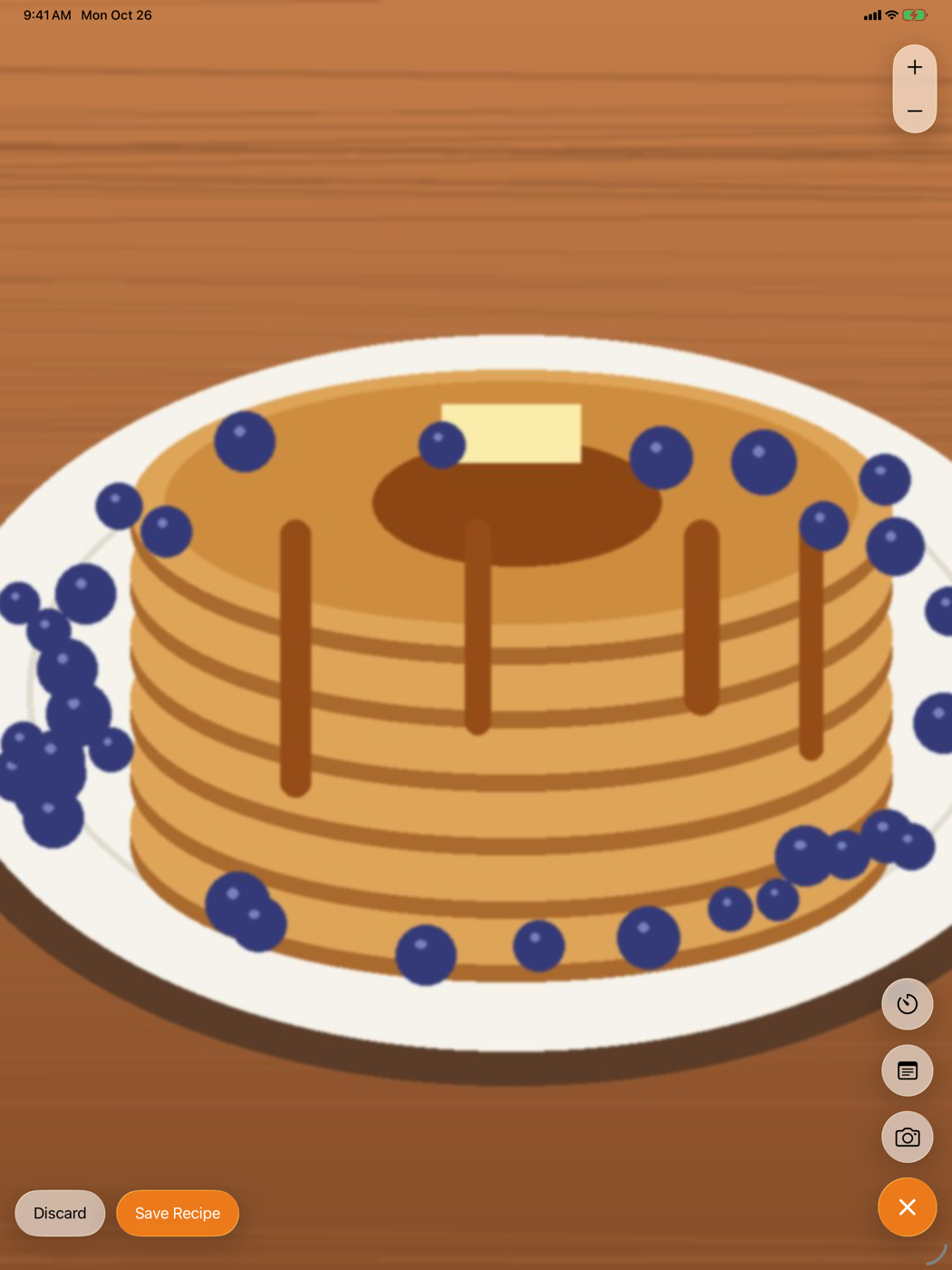
At rest, the orange “+” floats in the bottom corner over the pancakes, with the zoom pill top-right and the save bar bottom-left. Tap “+” and the three action buttons bead off the top of it and slide up into a column, while the plus turns into a cross. Tap any action, or the cross, and they flow back down into the orange button. The zoom pill reads as one capsule with two halves, and each half flexes on its own when pressed.
Kitchen notes
- One container per cluster. Shapes only morph and blend with shapes in the same
GlassEffectContainer. It also renders them together, which Apple notes is better for performance than many separate glass views. - Glass on glass doesn’t stack. Don’t put a glass button inside a glass card. Glass samples the content behind it, and layers of glass muddy each other; keep glass to the floating layer.
- Tint sparingly. A tint marks the primary action. Tinting every button removes the hierarchy it’s there to create.
- Label every icon. Icon-only glass buttons still need names:
Labelwith.labelStyle(.iconOnly)keeps the title for VoiceOver, and the toggle’saccessibilityLabelchanges with its state. - Variants.
.regularis the standard material and the right default..clearis a more transparent variant; check legibility carefully if you use it, since it lets more of the background through.
— 30 —
Rich Text Notes Editor
Edit styled text in SwiftUI with TextEditor and AttributedString, then add custom formatting controls that follow the selection.
Liquid Glass Tab Bar with a Now-Playing Tray
Build the iOS 26 music-app shell: a tab bar that minimizes on scroll, a now-playing tray, and a dedicated search tab.