Edge-to-Edge Hero Header
A detail screen whose photo runs under the navigation bar and the iPad sidebar, with a soft blur where content meets the toolbar and glass buttons grouped the way iOS 26 intends.
- Serves
- iOS 26+ · iPhone and iPad
- Prep time
- 20 minutes
- Kitchen-tested
- Compiled with Xcode 26.6 · iOS 26.5 simulator · Oct 26, 2026
- Difficulty
- ★☆☆
.backgroundExtensionEffect().scrollEdgeEffectStyle(_:for:)ToolbarSpacer(.fixed, placement:).navigationSubtitle(_:).ignoresSafeArea(edges: .top)- A
NavigationSplitViewto show it off on iPad
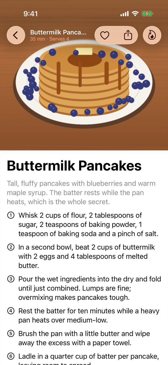
The detail screens in Apple’s own iOS 26 apps share a look: the hero photo doesn’t stop at the navigation bar, it runs right up under it, and on iPad it keeps going underneath the translucent sidebar. Where the list scrolls beneath the toolbar there is no hard line, just a soft fade. None of this needs custom blur views anymore. It comes from a handful of new modifiers.
This recipe builds a recipe-detail screen (a cookbook within a cookbook) with that treatment, inside a split view so it works on both iPhone and iPad.
Method
1. Start with a split view
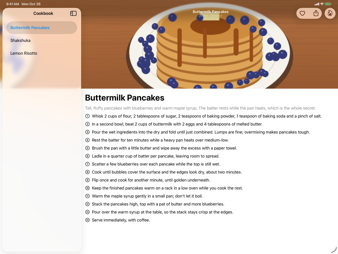
On iPad the sidebar floats over the detail column as a glass panel. That is exactly where the background extension effect earns its keep. On iPhone the same code collapses into a normal navigation stack.
1
2
3
4
5
6
7
8
9
10
11
12
13
14
15
16
17
18
19
20
21
22
23
24
25
26
27
28
29
struct Recipe: Identifiable, Hashable {
    let id = UUID()
    let title: String
    let summary: String
    let heroImage: String
    let minutes: Int
    let servings: Int
    let steps: [String]
}

struct CookbookView: View {
    let recipes: [Recipe]
    @State private var selection: Recipe?

    var body: some View {
        NavigationSplitView {
            List(recipes, selection: $selection) { recipe in
                NavigationLink(recipe.title, value: recipe)
            }
            .navigationTitle("Cookbook")
        } detail: {
            if let selection {
                RecipeDetailView(recipe: selection)
            } else {
                ContentUnavailableView("Pick a Recipe", systemImage: "fork.knife")
            }
        }
    }
}
2. Pull the hero under the bars
Two modifiers do different jobs here, and the difference matters. .ignoresSafeArea(edges: .top) lets the scroll view’s content start at the very top of the screen, so the photo sits under the navigation bar. .backgroundExtensionEffect() then fills any remaining safe-area edges around the image — under the iPad sidebar, or the side insets of an iPhone in landscape — with mirrored, blurred copies of it, so the image appears to continue beneath the glass.
1
2
3
4
5
6
7
8
9
10
11
12
13
14
15
16
17
18
19
20
21
22
23
24
25
26
27
28
29
30
31
32
33
34
35
36
struct RecipeDetailView: View {
    let recipe: Recipe

    var body: some View {
        ScrollView {
            VStack(alignment: .leading, spacing: 0) {
                Color.clear
                    .frame(height: 360)
                    .overlay {
                        Image(recipe.heroImage)
                            .resizable()
                            .aspectRatio(contentMode: .fill)
                    }
                    .clipped()
                    .backgroundExtensionEffect()

                VStack(alignment: .leading, spacing: 12) {
                    Text(recipe.title)
                        .font(.largeTitle.bold())
                    Text(recipe.summary)
                        .foregroundStyle(.secondary)
                    ForEach(Array(recipe.steps.enumerated()), id: \.offset) { index, step in
                        Label(step, systemImage: "\(index + 1).circle")
                    }
                }
                .padding()
            }
        }
        .ignoresSafeArea(edges: .top)
        .scrollEdgeEffectStyle(.soft, for: .top)
        .navigationTitle(recipe.title)
        .navigationSubtitle("\(recipe.minutes) min · Serves \(recipe.servings)")
        .navigationBarTitleDisplayMode(.inline)
        .toolbar { RecipeToolbar() }
    }
}
Why the Color.clear and overlay? An image with .aspectRatio(contentMode: .fill) and only a height still reports its natural width: a landscape photo 360 points tall is wider than an iPhone screen. Put it straight in the stack and it widens the whole column, pushing the title and text off the leading edge; .clipped() hides the overflow but doesn’t fix the layout. Color.clear takes exactly the width it’s offered, so the photo fills that box and nothing more. (Our first draft of this recipe had exactly that bug, and the test kitchen’s screenshots caught it.)
Apply the extension effect to a single background view, not to every image on the screen. Apple’s documentation is explicit about using it with discretion: each use duplicates the view and blurs the copies, and the modifier clips the view so the copies never overlap it.
3. Soften the edge
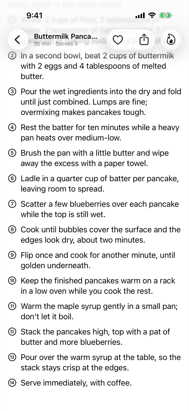
Scroll views already draw an automatic edge effect where content passes under a toolbar. .scrollEdgeEffectStyle(.soft, for: .top) asks for the subtle, blurred version; .hard gives a crisper, nearly opaque boundary, which suits dense text such as a spreadsheet or a code editor. Pass .automatic to go back to the system choice.
4. Group the toolbar the iOS 26 way
In iOS 26, toolbar items sit on glass, and adjacent items share one glass capsule. Use ToolbarSpacer to split them into groups by meaning: the everyday actions together, the primary action on its own.
1
2
3
4
5
6
7
8
9
10
11
12
13
14
struct RecipeToolbar: ToolbarContent {
    var body: some ToolbarContent {
        ToolbarItemGroup(placement: .topBarTrailing) {
            Button("Favourite", systemImage: "heart") { }
            Button("Share", systemImage: "square.and.arrow.up") { }
        }

        ToolbarSpacer(.fixed, placement: .topBarTrailing)

        ToolbarItem(placement: .topBarTrailing) {
            Button("Start Cooking", systemImage: "flame") { }
        }
    }
}
.fixed inserts a standard gap. .flexible expands to fill whatever space is left, which is useful in a bottom toolbar to push items to opposite ends.
Plating
On iPhone the photo fills the top of the screen with the back button and the two toolbar capsules floating over it. Scroll up and the text slides under the toolbar through a soft blur, while the inline title and its “35 min · Serves 4” subtitle take over. On iPad, open the sidebar: instead of the photo stopping at the sidebar’s edge, a blurred reflection of it continues underneath the glass, and the detail column feels full-bleed.
Kitchen notes
- Subtitle availability.
navigationSubtitlehas existed on macOS since 2022 but only arrived on iOS and iPadOS in 26. If you still support iOS 18, guard it withif #available(iOS 26, *)inside a small view modifier. - Legibility over photos. Toolbar glass adapts to what’s behind it, but a very bright or very busy photo can still fight the title. A subtle dark gradient at the top of the image helps more than you’d think.
- Hiding a single item’s glass. For an item that should not get the shared glass background, such as a profile avatar, apply
.sharedBackgroundVisibility(.hidden)to thatToolbarItem. - One hero per screen. Stacking several background extensions on one screen costs performance and muddies the effect. Pick the one image that defines the screen.
— 30 —
Liquid Glass Tab Bar with a Now-Playing Tray
Build the iOS 26 music-app shell: a tab bar that minimizes on scroll, a now-playing tray, and a dedicated search tab.
Contacts-Style Alphabet Index
Add the classic A–Z section index to a SwiftUI List with sectionIndexLabel — no UIKit bridge required.