Liquid Glass Tab Bar with a Now-Playing Tray
A music-app shell whose tab bar shrinks as you scroll, a mini player that rides above it, and a search tab that sits apart — all in about forty lines.
- Serves
- iOS 26+ · iPhone and iPad
- Prep time
- 20 minutes
- Kitchen-tested
- Compiled with Xcode 26.6 · iOS 26.5 simulator · Oct 26, 2026
- Difficulty
- ★☆☆
TabView(selection:)with value-basedTabitemsTab(value:role:)with the.searchrole.tabBarMinimizeBehavior(.onScrollDown).tabViewBottomAccessory { }@Environment(\.tabViewBottomAccessoryPlacement)- An
@Observableplayer model
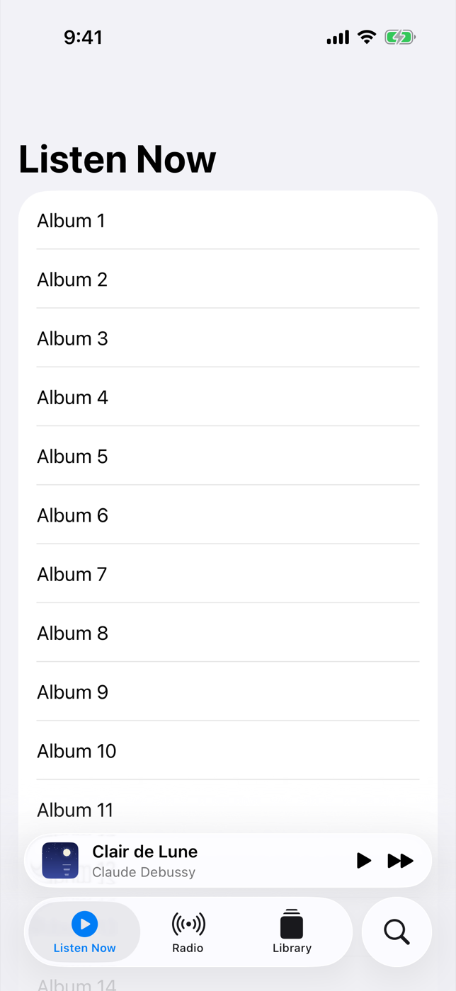
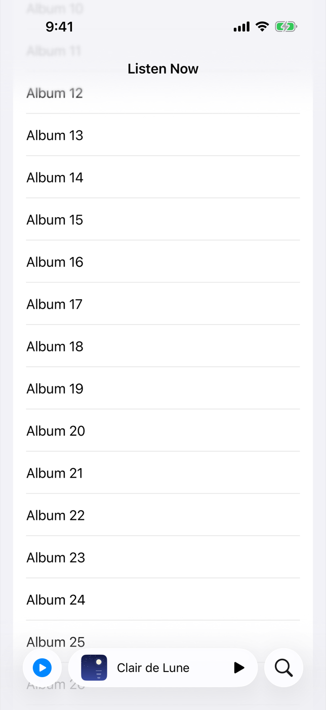
Open Music or Podcasts on iOS 26 and the tab bar behaves like a living thing: scroll down and it tucks itself into a small glass capsule, while the mini player slides down to sit beside it. Scroll back up and both spring back into place. Until now, faking this took a custom tab bar and a lot of geometry reading. In iOS 26 it is three modifiers on a stock TabView.
This recipe builds that shell for a music app: three content tabs, a search tab, and a now-playing tray that changes its layout depending on where the system puts it.
Method
1. Model the tabs as values
Give every tab a value so you can drive selection from code, such as jumping to Search from a keyboard shortcut or a deep link. An enum keeps it tidy:
1
2
3
4
5
6
7
8
9
10
11
12
13
14
15
enum AppTab: Hashable {
    case listenNow, radio, library, search
}

@Observable
final class PlayerModel {
    var title = "Clair de Lune"
    var artist = "Claude Debussy"
    var artwork = "cover-debussy"
    var isPlaying = false
    var isFullScreenPresented = false

    func togglePlayback() { isPlaying.toggle() }
    func skip() { /* advance the queue */ }
}
2. Build the shell
The search tab uses the .search role, which does two things for free: the system supplies its label and icon, and on iPhone it is set apart from the other tabs at the trailing edge of the bar. The three modifiers at the bottom do the rest.
1
2
3
4
5
6
7
8
9
10
11
12
13
14
15
16
17
18
19
20
21
22
23
24
25
26
27
28
29
struct MusicShell: View {
    @State private var selection: AppTab = .listenNow
    @State private var player = PlayerModel()

    var body: some View {
        TabView(selection: $selection) {
            Tab("Listen Now", systemImage: "play.circle", value: .listenNow) {
                ListenNowView()
            }
            Tab("Radio", systemImage: "dot.radiowaves.left.and.right", value: .radio) {
                RadioView()
            }
            Tab("Library", systemImage: "square.stack", value: .library) {
                LibraryView()
            }
            Tab(value: .search, role: .search) {
                SearchView()
            }
        }
        .tabBarMinimizeBehavior(.onScrollDown)
        .tabViewBottomAccessory {
            NowPlayingTray()
        }
        .fullScreenCover(isPresented: $player.isFullScreenPresented) {
            NowPlayingScreen()
        }
        .environment(player)
    }
}
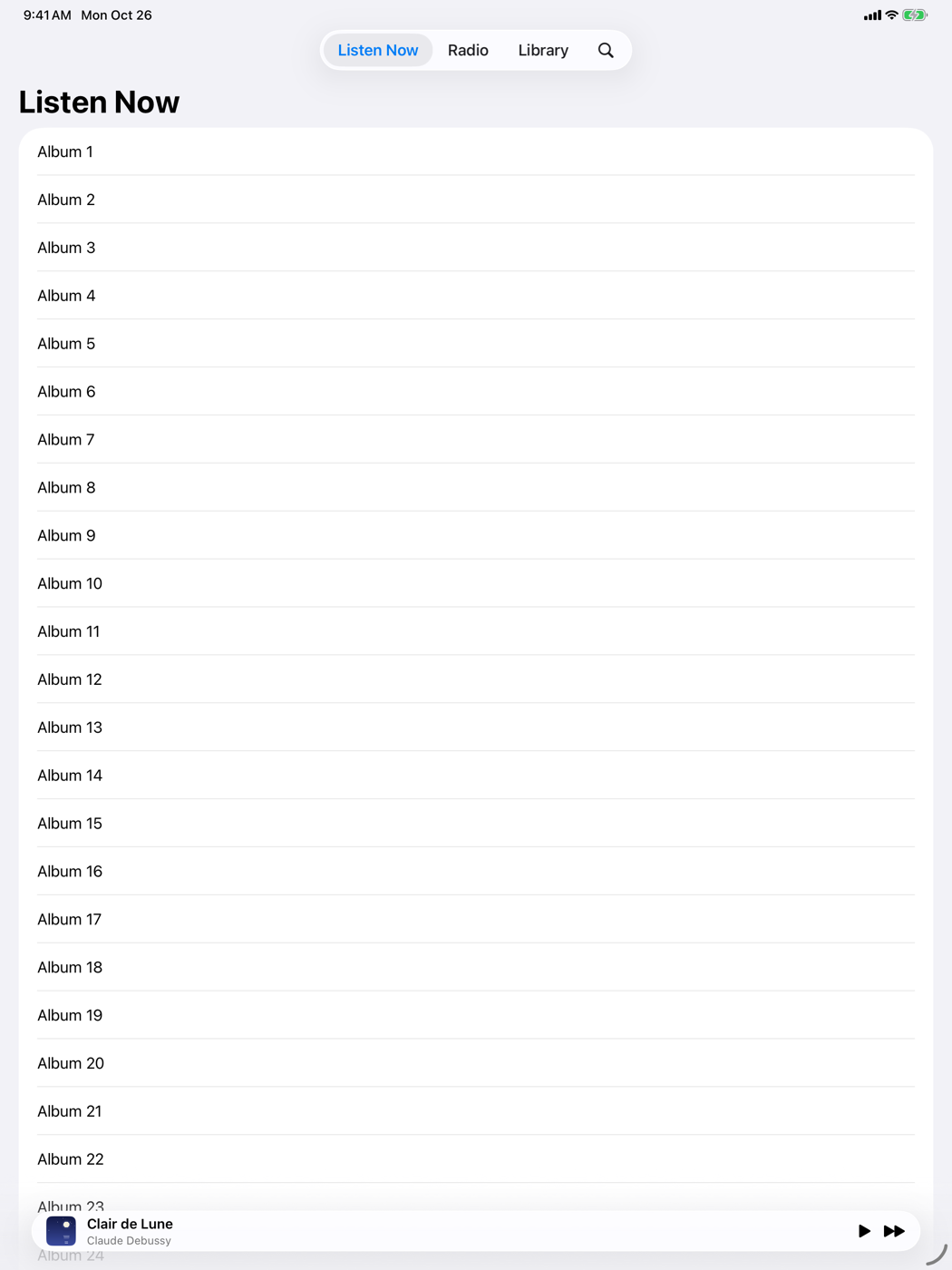
.tabBarMinimizeBehavior(.onScrollDown) collapses the bar as soon as the reader starts scrolling down, and restores it when they scroll back up. There is also .onScrollUp, .never, and the default, .automatic. Minimizing only happens on iPhone; on iPad the modifier is simply ignored, so you can apply it unconditionally.
3. Make the tray respond to its placement
The accessory is not one fixed shape. When the tab bar is full size, the accessory sits above it as a wide bar. When the bar minimizes, the accessory moves inline, squeezed into the space beside the collapsed tab bar. SwiftUI reports which one is current through the environment, so the tray can drop detail when space is tight:
1
2
3
4
5
6
7
8
9
10
11
12
13
14
15
16
17
18
19
20
21
22
23
24
25
26
27
28
29
30
31
32
33
34
35
36
37
38
39
struct NowPlayingTray: View {
    @Environment(PlayerModel.self) private var player
    @Environment(\.tabViewBottomAccessoryPlacement) private var placement

    var body: some View {
        HStack(spacing: 12) {
            Image(player.artwork)
                .resizable()
                .aspectRatio(1, contentMode: .fill)
                .frame(width: 32, height: 32)
                .clipShape(.rect(cornerRadius: 6))

            if placement == .expanded {
                VStack(alignment: .leading) {
                    Text(player.title).font(.subheadline.weight(.semibold))
                    Text(player.artist).font(.caption).foregroundStyle(.secondary)
                }
                .lineLimit(1)
            } else {
                Text(player.title).font(.subheadline).lineLimit(1)
            }

            Spacer(minLength: 0)

            Button(player.isPlaying ? "Pause" : "Play",
                   systemImage: player.isPlaying ? "pause.fill" : "play.fill") {
                player.togglePlayback()
            }
            if placement == .expanded {
                Button("Next", systemImage: "forward.fill") { player.skip() }
            }
        }
        .labelStyle(.iconOnly)
        .foregroundStyle(.primary)
        .padding(.horizontal)
        .contentShape(.rect)
        .onTapGesture { player.isFullScreenPresented = true }
    }
}
The environment value is optional: it is nil when the view isn’t inside a bottom accessory, which is handy if you reuse the same view elsewhere. Comparing an optional to .expanded works as you’d expect.
4. Give each tab something to scroll
The tab bar only minimizes when there is a scroll view to watch. Any List or ScrollView at the root of a tab works:
1
2
3
4
5
6
7
8
9
10
11
12
13
14
15
16
17
18
19
20
21
22
struct ListenNowView: View {
    var body: some View {
        NavigationStack {
            List(1...40, id: \.self) { index in
                Text("Album \(index)")
            }
            .navigationTitle("Listen Now")
        }
    }
}

struct SearchView: View {
    @State private var query = ""

    var body: some View {
        NavigationStack {
            List { /* results for query */ }
                .navigationTitle("Search")
                .searchable(text: $query)
        }
    }
}
Plating
Run it on an iPhone simulator and scroll the Listen Now list. The tab bar shrinks to a single glass capsule showing the current tab, and the tray slides down beside it, losing its artist line and Next button. Scroll up and everything expands again. Tap the tray and the full-screen player appears from any tab, because the accessory and the cover live on the TabView, not inside a tab.
Kitchen notes
- The tray is global. The accessory shows on every tab, so treat it as app-wide chrome. When nothing is queued, show a quiet “Not Playing” state rather than an empty bar.
- Keep inline content short. In the inline placement the tray shares a single row with the collapsed tab bar. An icon and one line of text is the practical limit.
- Hit targets.
.labelStyle(.iconOnly)keeps the titles for VoiceOver while showing only the icons, so “Play” and “Next” are still announced properly. - Selection is state. Because tabs are values,
selection = .searchfrom anywhere in the app switches tabs, which pairs nicely with the deep-link router from NavigationStack Deep Links in Forty Lines.
— 30 —
Morphing Glass Buttons
Build a floating glass action button that morphs into a cluster, fuse controls with glass unions, and use the .glass button styles....
Edge-to-Edge Hero Header
Let a hero image flow under the toolbar and sidebar with backgroundExtensionEffect, soft scroll edges, and grouped glass toolbar items.